


A geographical chart is a map that displays the physical features of a particular area. They can be used to show things like elevation changes, rivers, forests, and other landmarks. They can also be used to show political boundaries, major cities, and other human-made features. If you’re interested in learning about the variations to these charts, learn more about the different visuals and data types used for geographical and map charts.
Are there different variations of geographical charts?
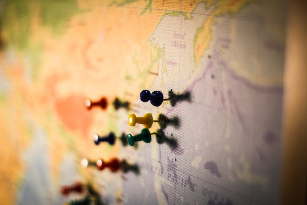
There are a variety of different types of geographical charts that can be used to represent data geographically. The most common are region, marker, text, and heat map charts. Region charts show a geographic area, usually in the form of a map, and highlight the data for a specific area with a color or marker. Marker charts use symbols or markers to show the location of data points on a map. Text charts use text to label or identify specific areas on a map. Heat map charts use colors to represent data values, with the colors correlating to a temperature scale. This allows users to see patterns and trends in the data.
Each type of geographical chart has its own strengths and weaknesses. Region charts are the most complete and accurate, but they can be difficult to read if there are a lot of data points. Marker charts are easy to read but can be inaccurate if the markers are not placed correctly. Text charts are the most accurate when it comes to labeling areas, but they can be difficult to read if there is a lot of data. Heat map charts are the most visually appealing, but they can be difficult to read if the data is not properly organized.
Ultimately, the type of geographical chart that is best suited for a specific dataset depends on the data itself and the goals of the visualization.
Why use a geographical chart?
There are many reasons why you might want to use a geographical chart in your work. Perhaps you are studying the spread of disease and want to see where it is most prevalent, or you are investigating the impact of a natural disaster and want to see which areas have been affected. A geographical chart can also be used to show the location of a company or organization or to illustrate the distribution of a population.
How do you create geographical charts?
When creating a geographical chart, it is important to choose the right type of map to use. A world map, for example, can be used to show the distribution of a population or to illustrate the location of a company or organization. A map of a specific region can be used to show the spread of a disease or the impact of a natural disaster. The most common types of geographical charts are:
- World maps
- Maps of specific regions
- Maps of individual countries
- Maps of metropolitan areas
- Maps of boroughs or counties
- Maps of electoral districts
- Maps of postal districts
As you can see, there are many ways to use this to showcase data.
Are there challenges to using this chart type?

Maps are a great way to display geographical information. However, when using a geographical chart, there are several challenges that you may face. One challenge is that the map may be too small to show all of the relevant information. Another challenge is that the map may be too large, making it difficult to see all of the details. Additionally, the colors and symbols on the map may not be clear, making it difficult to understand the information. Finally, the map may not be up-to-date, which can be problematic when trying to make decisions based on the information displayed.
Now that you’re aware of how geographical regions can be displayed on a chart, you can utilize the different types to showcase your data and analytics effectively.