


Table Of Contents:
- Transforming Spaces With Color Psychology in Home Decor
- Unleashing the Power of Color Psychology in Home Decor
- Understanding the Basics of Color Psychology
- How Colors Influence Mood and Space Perception
- Selecting the Right Color Palette for Each Room
- Maximizing Small Spaces With Strategic Color Choices
- Using Light Colors to Create the Illusion of Space
- Accents That Expand: Bold Colors in Small Doses
- The Importance of Color Contrast and Balance
- The Impact of Colors on Well-Being and Emotions
- Colors That Promote Relaxation and Calmness
- Energizing Spaces With Vibrant Color Schemes
- Creating a Comforting Ambiance With Warm Tones
- Color Trends in Home Decor and Their Psychological Effects
- Exploring Current Color Trends and Their Meanings
- How to Incorporate Trending Colors Without Overwhelming Your Space
- Adapting Color Trends to Reflect Your Personal Style
- The Role of Natural Light in Color Perception
- Understanding How Natural Light Affects Colors
- Choosing Colors Based on Room Orientation and Light Availability
- Enhancing Natural Light With Reflective Colors
- Tips for Implementing Color Psychology in DIY Projects
- Step-by-Step Guide to Choosing Paint Colors
- Incorporating Textiles and Accessories to Complement Wall Colors
- Personalizing Spaces With Colorful Art and Decor Accents
- Conclusion
Transforming Spaces With Color Psychology in Home Decor
Home decor is not just about aesthetics; it can significantly influence our emotions and overall well-being. By harnessing the principles of color psychology, you can create spaces that enhance imagination, support stress management, and even alleviate feelings of sadness. Colors can also play a role in stimulating appetite, making thoughtful color choices essential for dining areas. As you navigate this fascinating realm of color in your home, you will learn how to strategically transform even the smallest spaces. Keep reading to discover practical tips and insights that will help you make color choices that positively impact your life.
Unleashing the Power of Color Psychology in Home Decor
Color psychology is a compelling aspect of home decor that I find fascinating. By understanding the basics of chromotherapy, we can tap into how different shades affect our emotions and perceptions of space. For example, certain hues can foster relaxation in a bathroom, turning it into a serene escape from daily stress. The careful selection of a color scheme not only enhances the aesthetics of a room but also influences our overall well-being. I’ve learned that the right colors can elevate mood, clarify intent, and create an inviting atmosphere that resonates with our personal style.
Understanding the Basics of Color Psychology
As I delve deeper into color psychology, I realize how the brightness of a hue can impact one’s perception of cleanliness in a space. Brighter colors often suggest a fresh and tidy environment, while darker shades can feel stifling if overused. The wavelength of a color also plays a critical role; longer wavelengths generally evoke warmth and comfort, whereas shorter wavelengths can bring a refreshing quality that stimulates the senses.
I’ve discovered that the right colors can significantly influence productivity, especially in workspaces. Utilizing shades that mimic daylight can enhance focus and energy levels, making tasks feel less daunting. A well-thought-out color scheme, considering both brightness and wavelength, creates an environment that encourages creativity and efficiency. Visit test.com for more information.
How Colors Influence Mood and Space Perception
The colors I choose for my home can truly affect my mood and how I experience each space. For instance, shades of blue can promote calmness, slowing down my breathing and providing a sense of tranquility. On the other hand, red tends to raise the frequency of energy in a room, which can invigorate but also lead to heightened emotions, including excitement or even aggression, depending on its use.
Incorporating minimalism into my decor enhances how colors interact with my surroundings. When I opt for a pared-down aesthetic, the colors I select stand out more distinctly, allowing me to fully appreciate their impact on mood. The simplicity of minimalism not only emphasizes each hue‘s essence but also creates a harmonious flow that nurtures comfort and enhances the overall atmosphere of my living spaces.
Selecting the Right Color Palette for Each Room
When selecting a color palette for each room, I find that color psychology plays a vital role in shaping the atmosphere. For instance, in my creative spaces, I often use hues like violet, which inspire creativity and encourage original thought. The right blend of colors can invigorate the mind and foster an environment where ideas flourish.
In contrast, when I’m choosing colors for areas where I need to feel confident, such as a home office, I lean toward more grounded colors. Rich shades can enhance feelings of assurance, making the space feel established and secure. By recognizing how different hues evoke various emotions, I can create a home that not only reflects my personal style but also supports my mental well-being.
Maximizing Small Spaces With Strategic Color Choices
Maximizing small spaces through color selection has been an enlightening journey for me. I’ve discovered that using light colors can cleverly create the illusion of more space, making even the coziest corners feel open and airy. On the flip side, introducing bold accents in small doses can expand the visual landscape, infusing optimism without overwhelming the senses. Balancing these choices with careful color contrast has allowed me to mitigate feelings of loneliness that often accompany confined spaces. I often find myself experimenting with various shades, guided by intelligence in design principles, as I seek to create a harmonious environment that invites social interaction and comfort.
Using Light Colors to Create the Illusion of Space
When I choose light colors for a small space, I often lean towards soft shades of blue. These hues not only evoke a sense of calm but also work wonders in making the area feel larger and more open. I appreciate how lighter colors reflect natural light, creating an airy atmosphere that instantly lifts my mood.
In my experience, olive tones also play a crucial role in maximizing space without overwhelming it. They subtly add depth while maintaining a light and inviting feel, aligning with my design preference for balance. I’ve frequently found inspiration from HGTV, discovering how color choices can transform a room’s perception, breathing life into even the most compact environments.
Accents That Expand: Bold Colors in Small Doses
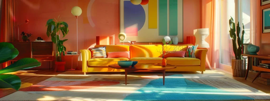
In my experience, incorporating bold colors as accents can significantly enhance small spaces, creating an inviting atmosphere without overwhelming the senses. I often opt for vibrant upholstery or artwork that contrasts with shades of gray walls, as this combination adds visual interest while highlighting the space’s potential. This thoughtful approach not only uplifts the environment but also positively influences my well-being, helping to lower my blood pressure during moments of stress.
Additions like colorful throw pillows or striking wood furniture finishes harmonize beautifully with a neutral backdrop, transforming the area effortlessly. I find that these bold touches can bring warmth and personality into smaller rooms, encouraging a sense of openness and freedom. By focusing on strategic accents, I create a balance, ensuring the decor feels dynamic while still maintaining a soothing presence.
The Importance of Color Contrast and Balance
Color contrast and balance serve as foundational elements in my approach to home decor, particularly when aiming to evoke specific emotions. I’ve found that the interplay between contrasting shades can influence behavior, creating a dynamic space that invites conversation and enhances energy. For instance, pairing a rich navy with a bright coral can transform a small area, igniting enthusiasm and an engaging atmosphere.
Understanding the cultural significance of colors has also guided my choices in achieving harmony within a room. I intentionally balance vibrant hues with softer tones to establish a welcoming environment that resonates with my personal experience. This careful selection fosters a connection between the colors and the feelings they evoke, leading to an emotionally uplifting space that encourages social interaction and reflection.
The Impact of Colors on Well-Being and Emotions
The colors I choose to incorporate into my living spaces play a significant role in shaping my emotional landscape. Adopting principles from color theory has allowed me to strategically select hues that promote relaxation and calmness, creating serene retreats where I can unwind after a long day. In contrast, vibrant color schemes can energize areas, sparking creativity and boosting productivity when I’m feeling the pressures of daily life. Warm tones add a layer of comfort, transforming rooms into cozy havens that invite interaction and connection. With thoughtful placements of decorative elements, like a soft pillow in a rich primary color amidst neutral shades, I find that each color choice contributes to a balanced ambiance tailored to my needs and emotional well-being. Through this exploration, I’ve come to appreciate the profound impact color has, not only in decor but also in nurturing a space that resonates with my personal experience.
Colors That Promote Relaxation and Calmness
In my experience, incorporating soft hues like light blues and gentle greens into the architecture of my bedroom can create a calming dimension that significantly impacts my mind. These colors shift my perception of the space, transforming it into a serene sanctuary where relaxation flourishes. I have noticed how these soothing shades not only invite tranquility but also encourage a restful atmosphere that helps me unwind at the end of the day.
Furthermore, I’ve discovered that warm neutrals can also enhance the feeling of calmness within a room. When integrating these tones into my decor, I feel an immediate sense of comfort, as they seamlessly blend with my surrounding elements. This thoughtful selection of colors fosters a positive emotional response, allowing my bedroom to serve as a true retreat for both relaxation and reflection.
Energizing Spaces With Vibrant Color Schemes
When I infuse vibrant shades into my interior design, I can feel my energy shift instantly. Bold colors like bright greens and sunny yellows, reminiscent of fresh leaves, create a lively ambiance that fuels creativity and motivation. The dynamic contrast of these hues significantly enhances visual perception, making spaces feel alive and invigorating, ultimately contributing to a more positive atmosphere.
I’ve discovered that integrating vibrant colors not only uplifts my mood but also brings a sense of peace amidst the busyness of daily life. The interplay between energetic shades and calming tones in interior design creates a harmonious environment, allowing me to thrive while providing the relaxation I need. By embracing these lively colors, I create spaces that inspire action while maintaining a balance that nurtures my well-being.
Creating a Comforting Ambiance With Warm Tones
In my living room, I intentionally use warm tones like soft oranges and deep yellows to create an ambiance that feels inviting and cozy. These colors not only stimulate a sense of warmth but also have the power to lower my heart rate, contributing to a calming atmosphere. By carefully placing these hues on the walls and selecting complementary accessories, such as a fuchsia throw blanket, I bring an element of drama to the space without overwhelming it.
I’ve noticed that the warmth from these tones encourages social interaction, making my living room a space where conversations flow effortlessly. The combination of yellow accents with a rich orange wall creates an environment that feels both lively and comforting. In embracing these colors, the room transforms into a sanctuary that nurtures relaxation and fosters connection among friends and family.
Color Trends in Home Decor and Their Psychological Effects
As I observe the evolving landscape of home decor, I find myself intrigued by the current color trends and their deeper meanings. The resurgence of shades of green, for example, reflects a collective yearning for connection with nature and symbolizes both renewal and wealth. I appreciate how these colors can evoke feelings of serenity or vitality, depending on their application. However, I also recognize the potential for vibrant hues to convey aggression, particularly if not balanced thoughtfully within a space. By understanding the theory behind these trends, I can strategically incorporate them into my home, ensuring that they resonate with my personal style while maintaining a harmonious ambiance that feels inviting and nurturing.
Exploring Current Color Trends and Their Meanings
In my recent explorations of color trends, I’ve noticed a significant shift towards incorporating shades that evoke feelings of calmness and clarity. The introduction of sky blue into home decor symbolizes tranquility and openness, encouraging a peaceful environment that soothes the mind. This knowledge highlights how selecting the right colors can help foster an emotionally supportive space, counteracting the potential anger that darker hues, like grey, can sometimes elicit.
I’ve also observed that the juxtaposition of vibrant colors alongside calming pastels can create a dynamic balance within a room. While grey can bring sophistication, if overused, it risks overwhelming a space and contributing to a sense of stagnation. By thoughtfully integrating colors that resonate with both energy and serenity, I can effectively craft an atmosphere that nurtures well-being and provides a retreat from the chaos of everyday life.
How to Incorporate Trending Colors Without Overwhelming Your Space
In my own home, I’ve found that incorporating trending colors like teal can create an energizing yet calming effect in my dining room. I often paint an accent wall or use teal in decorative elements, allowing it to add joy without taking over the entire space. By keeping the ceiling a neutral shade, I can maintain a sense of balance, ensuring that the vibrant color brings pleasure rather than overwhelm.
When I want to showcase a bold color trend, such as a rich teal, I opt for smaller accessories like tablecloths or artwork to highlight specific areas. I believe this approach allows me to enjoy the striking hue while keeping the overall space airy and open. By thoughtfully selecting where to place these colors, I create an inviting atmosphere that feels both lively and harmonious in my dining area.
Adapting Color Trends to Reflect Your Personal Style
Incorporating trending colors into my home has become an expression of my personal style, reflecting my understanding of what resonates with me. For instance, I often choose warm shades, reminiscent of sunlight, to create a welcoming room that feels vibrant and alive. This not only enhances the space but also aligns with my desire for harmony, blending contemporary trends with my unique aesthetic preferences.
As I adapt these trends, I pay attention to how each color interacts with natural light throughout the day. Understanding the way sunlight shifts within a room allows me to select hues that will maintain their inviting quality, creating spaces that harmonize with both my personality and the atmosphere I wish to cultivate. This thoughtful approach transforms my living areas into reflections of my taste while fostering an emotionally supportive environment that nurtures well-being.
The Role of Natural Light in Color Perception
Understanding the impact of natural light on color perception has been a revelation in my decorating approach. I often consider how the availability and direction of light dramatically influence the hues I choose for each room. For instance, in spaces with abundant sunlight, shades of pink can appear warm and inviting, while in dimmer areas, those same colors might feel muted or cold. By assessing room orientation, I can select complementary colors that enhance the existing light, creating an inviting atmosphere. I’ve also learned that reflective colors, such as a striking royal blue, can maximize the effects of light, making spaces feel airier and more expansive. Additionally, incorporating tiles with lighter, glossy finishes not only beautifies but also effectively enhances the brightness of a room, allowing my palette to come alive.
Understanding How Natural Light Affects Colors
As I analyze how natural light interacts with my home’s colors, I notice its impact on my mental health. Spaces flooded with sunlight can transform cooler colors on the floor into vibrant, uplifting tones, enhancing the overall mood of a room. In contrast, areas that lack adequate light can make those same hues feel heavy and dim, which sometimes feels connected to increased levels of stress or even hypertension.
Additionally, I’ve observed how gender influences my color choices based on light conditions. For instance, more muted colors may appeal differently to various genders under natural light, affecting decisions about the color palette for shared spaces. By understanding these dynamics, I can tailor my environment to better suit the needs of those living in it, creating a harmonious home that supports everyone’s emotional well-being.
Choosing Colors Based on Room Orientation and Light Availability
When choosing colors for different rooms, I always consider their orientation within the home and how natural light interacts with each space. For instance, my south-facing rooms receive plenty of sunlight throughout the day, allowing me to experiment with bright and lively colors like soft yellows or warm whites, which create an uplifting atmosphere. In contrast, the north-facing areas lack direct sunlight, so I opt for warmer tones to counteract the cooler light, helping the space feel more inviting and cozy.
I find that the time of day can dramatically change how colors are perceived based on the light available. In my east-facing rooms, I often notice how morning light can make shades of blue and green appear vibrant, bringing an energizing feel to the space. As the day progresses, I carefully reassess my palette, ensuring that the chosen colors resonate with the light conditions at different times, fostering an environment that feels balanced and harmonious throughout the entire day.
Enhancing Natural Light With Reflective Colors
In my quest to enhance natural light in my home, I’ve discovered that incorporating reflective colors can dramatically transform a space. For example, I often choose lighter shades with glossy finishes for walls and décor, such as soft whites or pale yellows, allowing them to bounce sunlight around the room. This approach not only brightens my living areas but also creates a more open and airy atmosphere that uplifts my spirits.
I also consider materials that have reflective qualities, such as mirrors and metallic accents, to complement my color choices effectively. When strategically placed, these elements amplify the available light, making even smaller rooms feel more expansive. As I experiment with these techniques, I notice a significant improvement in the overall ambiance, fostering a cheerful and inviting environment that resonates with my aesthetic preferences.
Tips for Implementing Color Psychology in DIY Projects
In my journey of enhancing home decor, I’ve learned that color psychology is not just about selecting the right hues for walls; it extends to every element within a space. Starting with a systematic approach, I typically begin by choosing paint colors that resonate with the mood I want to create. Then, I carefully incorporate textiles and accessories that complement these colors, ensuring a cohesive look throughout the room. Adding personal touches, like colorful art and decorative accents, allows me to infuse my personality into the decor, transforming each area into a space that feels uniquely mine. This combination of thoughtful choices exemplifies how color can shape the overall atmosphere of my home.
Step-by-Step Guide to Choosing Paint Colors
When I approach choosing paint colors, I start by envisioning the mood I want to achieve in the room. For instance, if I’m looking to create a cozy area, I might gravitate toward warm tones like soft oranges or golden yellows. Visualizing the desired atmosphere helps me narrow down my options and select hues that align with my emotional goals.
Next, I test paint samples on the walls to see how they interact with the room‘s lighting. I apply swatches in different corners, allowing the colors to reveal their true nature under varying illumination throughout the day. This practical step ensures I select a shade that resonates well with both the space and my vision, ultimately guiding me toward a harmonious outcome.
Incorporating Textiles and Accessories to Complement Wall Colors
As I curate my living spaces, I find that textiles and accessories can significantly enhance the overall aesthetic and mood of a room. For instance, I often choose cushions and throws in colors that complement the wall hues, creating layers of texture and visual appeal. This thoughtful interplay not only reinforces my color scheme but also contributes to a cozy and inviting atmosphere that welcomes me and my guests.
Personalizing Spaces With Colorful Art and Decor Accents
To express my personal style, I prioritize selecting artwork and decorative accents that resonate with my tastes while enhancing the room‘s color scheme. I find that vibrant pieces, whether a striking canvas or eclectic sculptures, can bring a refreshing energy to the space, making it feel more inviting. These art pieces not only serve as focal points but also foster a deeper emotional connection to my surroundings.
I enjoy experimenting with different textures and materials in my decor selections, as they play a vital role in creating visual interest. Adding pops of color through decorative cushions or unique ceramics complements my overall aesthetic while transforming simple spaces into vibrant expressions of personality. Balancing these accents allows me to maintain a cohesive look while keeping the environment lively and engaging.
Conclusion
Transforming spaces with color psychology adds depth and emotion to home decor. Thoughtful color choices influence mood, productivity, and overall well-being, creating environments that resonate with personal experiences. By understanding how colors interact with natural light and each other, I enhance the atmosphere in every room. Ultimately, this approach fosters a home that reflects my style while nurturing comfort and connection.